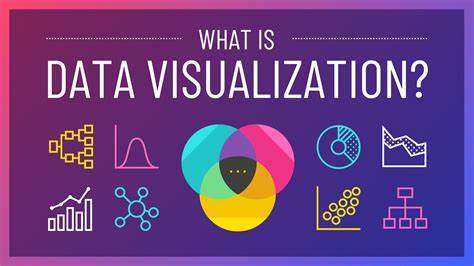
Data visualization is the process of turning data into a visual format, like charts, graphs, or maps, to help people understand and interpret the information more easily. It’s a way of showing data in a picture rather than rows of numbers, making patterns, trends, and insights easier to spot.
Why is Data Visualization Important?
- Simplifies Complex Data: Makes large or complex datasets easier to understand at a glance.
- Reveals Patterns and Trends: Highlights relationships, trends, or outliers in the data.
- Supports Decision-Making: Helps people make informed decisions by providing clear insights.
- Engages the Audience: Visuals are more engaging and memorable than raw numbers.
Types of Data Visualizations
- Charts:
- Bar Charts: Compare quantities across categories.
- Line Charts: Show trends over time.
- Pie Charts: Display proportions of a whole.
- Graphs:
- Scatter Plots: Show relationships between two variables.
- Histograms: Display frequency distributions.
- Maps:
- Heat Maps: Show data intensity geographically.
- Choropleth Maps: Use color shading to represent data in regions.
- Others:
- Tree Maps: Represent parts of a whole using nested rectangles.
- Network Graphs: Show relationships or connections.
Tools for Data Visualization
Popular tools include:
- Excel: Basic charts and graphs.
- Tableau: Interactive and advanced visualizations.
- Power BI: Integrates with data sources and creates dashboards.
- Python/R: Libraries like Matplotlib, Seaborn, or ggplot2 for custom visualizations.
Best Practices
- Know Your Audience: Tailor visuals to their needs and understanding.
- Keep It Simple: Avoid clutter and unnecessary details.
- Use the Right Chart: Match the chart type to the kind of data and insights you want to show.
- Highlight Key Insights: Use colors or labels to draw attention to important points.
- Be Accurate: Ensure your visuals don’t misrepresent the data.
Data visualization turns numbers into stories, helping people see and understand data in a clear and impactful way.


