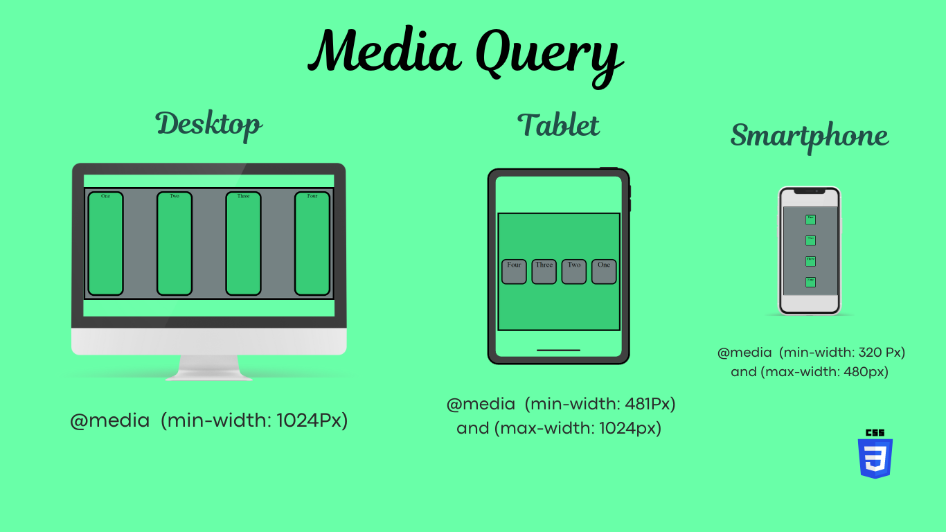
The purpose of CSS media queries is to create responsive web designs that adapt to different devices, screen sizes, and user contexts. Media queries enable you to apply specific styles depending on characteristics like screen width, height, orientation, and resolution, providing a tailored user experience. Here are some key purposes:
1. Responsive Layouts
Media queries allow you to adjust the layout and design of your website to suit various screen sizes, from mobile phones to tablets and desktop computers. This ensures that the content remains accessible and usable regardless of the device.
2. Enhanced User Experience
By tailoring the presentation of your website for different devices, media queries help provide an optimal viewing experience. Elements such as text, buttons, and images are adjusted to enhance readability and usability, leading to better engagement and satisfaction for users.
3. Device-Specific Styling
Media queries make it possible to apply different styles based on the type of device being used. You can create different designs or variations for mobile, tablet, or desktop screens, adapting the navigation, images, fonts, and other visual elements to match device capabilities.
4. Future-Proofing Designs
As new devices with varying screen resolutions and dimensions are constantly introduced, media queries help future-proof your website. You can define general breakpoints that adapt to a wide range of screen sizes, allowing your design to stay relevant as technology evolves.
5. Performance Optimization
Media queries can be used to load different assets depending on the user’s device. For example, lower resolution images can be loaded for mobile users to improve loading times, while higher resolution images can be served for larger screens. This helps optimize the performance of your website, particularly for users with limited bandwidth.
6. Content Prioritization
On smaller screens, you may want to prioritize specific pieces of content while hiding others. Media queries allow you to show or hide elements, rearrange layouts, and adjust the prominence of different content types to better match the needs of mobile versus desktop users.
Examples of Media Queries in Use
- Breakpoint Adjustments: Different styles for phones (
max-width: 600px), tablets (min-width: 601px and max-width: 1024px), and desktops (min-width: 1025px). - Adjusting Navigation: Simplify menus on mobile by hiding dropdown options and providing a hamburger icon instead.
- Optimizing Images: Serving smaller images for smaller screens and higher-resolution images for larger devices to save bandwidth and maintain image quality.
By using media queries effectively, you can create designs that are adaptable, user-friendly, and well-optimized for a variety of user contexts.

